Showing posts with label illustration. Show all posts

12.05.2011

IF - Brigade

This is my vision for the Illustration Friday subject this week - a brigade of peace makers, starting with one...

"Peace"
6.5 x 6.5
pastel on paper


This is another illustration that I used the process of scanning the original sketch. I then edited it in Photoshop, changing the pencil lines to black and blue. I also filled in the darkest areas with blue to avoid white paper showing through (below). I printed the photoshopped image on Canson paper and finished it with soft pastels and pastel pencils (above).

Finally, I scanned the completed illustration, printed it and tore the paper right to the edges of the image. Here's the finished product as a Christmas greeting card.

1.28.2011

IF - Surrender

A giraffe in a boat,
and a stubborn little girl with plans...
guess who surrenders?


Tea Party
4x6

This is one entry in my sketchbook for
The Sketchbook Project: 2011

To see my complete sketchbook CLICK HERE.

1.27.2011

The Sketchbook Project: 2011 "Inside/Outside"

This is my contribution to The Sketchbook Project: 2011 with Art House Coop. My chosen theme is "Inside/Outside", which is great since I've been exploring dwellings in my illustrations as well as my fine art paintings. That seems to be my thing lately - tree houses, playhouses, windows, doors, interiors, etc, so it was a fun project for me. Of course, I had a gazillion more ideas that never made it to the sketchbook, but at least some of them are on paper.

The sketchbooks will be on tour around the country throughout 2011, ending as part of the permanent collection at the Brooklyn Art Library.
----


----

To find out if The Sketchbook Project: 2011
is touring in your area CLICK HERE

1.17.2011

Book Cover Illustration and Design

I recently worked on a project for a book cover, so I thought I'd share a little of the process with you.

First I met with the author of the book and discussed the core message which I'll do my best to summarize:

Trumping the Red Queen
by Ralph Frid, Ph.D., is a heavily researched book that takes a serious look at innovation and creativity in today's times. The Red Queen from Alice in Wonderland is used as a metaphor. She represents business structures and systems born in the industrial revolution which no longer work efficiently in our fast paced, changing world. In the book the author explains a unique form of learning called Hyperstruction, increasing innovation and creativity without running everyone into the ground.

The client wanted the character of the queen to be the focal point of the cover.
She is dictatorial, mythological, rigid, feared and living in the past. She is satisfied with her reality as she explained it to Alice, "Now, here, you see, it takes all the running you can do, to keep in the same place. If you want to get somewhere else, you must run at least twice as fast as that!"
It was also important that the cover expressed an element of hope, innovation, and new beginnings.

At first, all I could think about was, "Fifteen years of the author's life has been devoted to the the research and writing of this book and I only have a few weeks illustrate the cover. I'd better make this illustration count!" Then I got to work reading the Trumping the Red Queen, and researching the characters in the original stories of Alice in Wonderland and Through the Looking Glass to refresh my memory.

The next step was brainstorming with lots of rough sketches: Different types of crowns, ways to illustrate the old crumbling system... and how do you illustrate creativity or hope, anyway? Should I use symbols of the red queen or an outright portrait?

Then I pulled together elements from the rough sketches and came up with the portraits above. The last one was just for fun... couldn't resist!

I also explored other approaches using symbols for the queen rather than a character. On the left, gears & smoke stacks to represent the industrial revolution, and figures struggling to stay ahead the old way. On the right I went for a more techie feel to represent our times, the instability of change and movement into the future.

The client loved the center portrait of the Queen of Hearts.
I used angular features and a downcast gaze to project the queen's character. I used gears and smokestacks as symbols of the industrial revolution. I chose Black, white, red, yellow, the traditional colors of playing card, and mimicked the typical Queen of Hearts pose. Factory smokestacks, industrial gears, fast moving freeways represent our fast paced world today and echo the queen's words to Alice.

Below are some different ideas about placement on the cover to dramatize the deterioration of the old way.

The client chose the middle image because it is bold and straight forward. The only element missing in the design was an element of hope which I added later on the computer.

I created the portrait of the Queen of Hearts using soft pastels and pastel pencils on white PastelMat, which was the perfect surface. It's velvety texture took layers of rich color easily and it was easy to get a smooth thin line as well for the details. I used PanPastels to block in color of the main elements and shadows, applying rich solid color quickly. The variety shapes of the small Sofftool Knives, were very easy to use for filling in colors and blocking in square or triangular shapes. I then added details with pastel pencils.

The above left image was scanned on my home computer which just didn't cut it, even with editing. So, I had the illustration scanned professionally, enhanced the color in Photoshop to match the color of the original, cleaned it up a bit and added the pawns, which were drawn and scanned separately (right). At this point it was ready incorporate into the cover design.

I used Adobe Illustrator to add bold red and yellow color creating a glow and a swirl design to give the impression of movement. I put the layout together in InDesign. Here is the final cover design of the book submitted to the publisher.


Read more about
Trumping the Red Queen by Ralph Frid, Ph. D on the. Official Blog

3.19.2010

Moonbeam Award Arrived!

The official Moonbeam award and metal arrived!


We Eat Food That's Fresh!
was received the 2009 Moonbeam Best Illustrator Silver Award (#36), which I'm thrilled about, of course! It also received the Picture Book - Preschool Silver Award (#7). My congratulations to the author, Angela Russ-Ayon and publisher, Our Rainbow Press, for a job well done!


"The Moonbeam Children’s Book Awards are intended to bring increased recognition to exemplary children’s books and their creators, and to support childhood literacy and life-long reading."

1.23.2010

IF - Clumsy

Illustration Friday word for this week is Clumsy. Yep, that's me.

Two Scoops Deluxe
9 x 12
pastel on paper

9.08.2009

We Love the Company

A new children's book/CD has been released to teach good manners. A much needed subject, don't you think?

I am tickled to announce illustrator, Irina Mirskaya will be attending our book signing with her new book We love the Company along with myself, illustrator of We Eat Food That's Fresh! and Angela Russ-Ayon, the talented songwriter, and author of both books.

Chemers Gallery
17300 17th Street, Tustin
Saturday
, September 12th, 4-6

Please join us!

Angela Russ-Ayon, owner of AbridgeClub.com and, is a nationally recognized, award-winning singer-songwriter, children's book author, trainer, keynote speaker, performer, and producer of interactive & educational children’s media. Her specialty is engaging young children in interactive song and dance using fine & gross motor activities that promote imaginative play and bridge educational gaps. During production, she works closely with colleagues and professionals in the field of child development and physical fitness. The time she spends in front of children either performing, participating in city programs, in preschools, and in school districts gives her the perfect hands-on testing grounds for her music.


Irina Mirskaya, A native of Russia, Irina Mirskaya has always been fascinated with art. When she paints, Irina says, she lives in a fantasy world of fairy tales and childhood memories. Irina enjoys both digital imaging and conventional painting with watercolor, gouache, dyes and pen and ink. Irina is working in a field of design and illustration. Her experience includes working as a designer/stylist in the textile industry, teaching art at Otis College and publishing greeting cards. Irina is a member of the Society of Children's Book Writers and Illustrators. We Love the Company is the first childen's book she has illustrated.


MORE ABOUT THE EVENT HERE

Facebook Event Page

4.18.2009

IF - Impossibility

It's not an impossibility to go back in time when you have good memories. When I was five, my grandfather built a playhouse, dutch door and all, which provided a place for endless hours of make-believe for me, my sisters, and friends.

The Playhouse
8 1/2 x 11
pastel

Idea... wash doll clothes. Bucket, water, bubbly soap.. good.
Bubbly soapy water & dirt... ooh mud!
Shovel, dishes... mud pies. Great!
Need sign. Paper, crayons, tape... sign. Now we're in business.
Hmm. What to do next?

Kitty, kitty, kitty!

4.07.2009

Picture Bookies Showcase

Good news for illustrators of children's books! Picture Bookies Showcase is now accepting submissions of illustrations to post on their blog. This is a great way for illustrators to get some web exposure and there is no cost. See Sherry Rogers' blog for all the details and get those illos out there!

The blog is sponsered by a small group of children's book illustrators:

1.13.2009

IF - Contained

Max's excitement could not be contained - wind or no wind.


It was just a little homemade kite made from a couple of plastic grocery bags and two wooden skewers. Though it had been breezy that morning, fate would have it, there was not a wisp of wind that afternoon, but Max was in love. He ran around the huge field like a wild stallion set free, towing his kite behind him. Wish I'd had my camera, but this will have to do.

I highly recommend these kite plans from an Austrailian website, MyBestKite.com. I stumbled across them while looking for inspiration for an illustration I'm working o that included kites.


Kassidy's Kite
decorated with permanent markers


The instructions looked so easy I had to try it. We let the grandkids decorate them with markers and helped them assemble the kites. It didn't take too long and they were amazingly easy to fly. We had no wind to speak of that afternoon, so the kids ran with them in tow & had a blast. Plus they were tuckered out that evening! Later we did have a chance to fly the kites with wind and they're very easy to fly... no skill required. Hope you can try them out!


PS: This is my first attempt at finishing a drawing in Photo Shop rather than pastels like I usually do... I enjoyed the process, but have quite a lot to learn to get the vibrant rich colors I like so much.

1.03.2009

IF - Resolve

Let's resolve to take more time to
smell the flowers in 2009.

"Tickled"
pastel on paper
8 x 10

Some "smell the flowers" moments from 2008 for me are:
  • Reading a story to a child.
  • Sighting a pair of Blue Birds in our back yard for the first time in 25 years of living here.
  • Soaking up the sights & sounds & smells of the California Coastal Redwoods, taking a million pictures as if I could capture some of it's grandeur in my little Canon.
  • Receiving a long distance "Happy Birthday song" on my voice mail from a grandchild. That was August - I still can't delete it :)
  • A summer evening walk by the beach with my one and only.
  • Spending the afternoon at the Discovery Science Center with the grandchildren and watching them explore with wonder and excitement. Spending the evening collapsed on the couch!
  • Waking up early one December morn to find a fresh cut Christmas tree adorned with lights that my husband had set up during the night to surprise me.
  • Playing Secret Santa and "Kris Kringling" a friend with a six year old.
  • Serving (at least) 20 cups of hot cocoa to my 2 year old granddaughter made in her Elmo kitchen. She drank every last make believe drop, then we made some more for Elmo.
  • A big pot of soup on a cold rainy day.

I'd love to hear about your "smell the flowers"
moments in 2008
.
Your comments are always welcome!

12.09.2008

Appreciation for Children's Books 7 Illustration is Thriving

This is the 7th year that I've been involved with the Chemers Gallery Children's Book Illustration Show in Tustin, CA. I have to say, the enthusiasm of our community is amazing! Visitors came from all over LA and Orange County. It's always a popular event, in fact we have customers ask as early as July if we've chosen the illustrators for the December show yet. I look forward to this event too. The illustrations are new, exciting and inspiring every year. It's always such a pleasure to meet the artists and observe as they happily meet their peers & fans and how they admire one another's original artwork with awe. Art buyers eagerly anticipate this time of year too, and are tickled to find treasured illustrations that speak to them and become part of their collections.
Melissa Sweet signing for a delighted fan (photo by yours truly)
Beth Krommes, Holly Meade, Elisa Kleven & Zachary Pullen were also present
At the opening Saturday, I couldn't help but notice, more than ever, what a grand celebration this event is for so many different kinds of people. It is a celebration of the craft of storytelling through illustration, a celebration of children's literature, a celebration of the love of reading, learning, and exploring our world. It is a celebration that is enjoyed by children and their parents and/or grandparents, together. Educators, librarians, children's book enthusiasts, art collectors, artists and writers all love viewing the original art, reading the stories, and listening to the artists as they share their insights. And, of course, giant piles of big, fat delicious cookies and Ronald McDonald magic tricks help add to the fun too!

Ronald McDonald entertaining visitors. (photo by Jennifer Geisert)
The impression I come away with is that even with all the razzle-dazzle of modern media, a love and appreciation for a good old fashioned "hold in your hand" children's book, and hand drawn illustrations are alive and well!

11.05.2008

IF - Vacant

This is my entry for Illustration Friday - VACANT

copyright cathy june 2008

There may be a vacant spot where her front tooth used to be,
but her mouth will soon be filled with fresh, juicy fruit.

This is the original cover illustration that I did for "We Eat Food That's Fresh" by Angela Russ-Ayon. Of course, it's been changed some to suit the needs for the cover. Click the image if you'd like to know more about the book, soon to be released by "Our Rainbow Press". Thank you for visiting my site!

3.09.2008

IF GARDEN

This is my entry for ILLUSTRATION FRIDAY this week.

Princess Charlotte, loves to read. She likes to read all kinds of stories about girls in other lands and books about animals, dinosaurs, and insects. Keep reading Princess Charlotte!


Princess Charlotte
pastel

GREEN THINGS GROWING
Oh, the green things growing, the green things growing,
The faint sweet smell of the green things growing!
I should like to live, whether I smile or grieve,
Just to watch the happy life of my green things growing...
~ Dinah Maria Mulock Craik

9.24.2007

As a child I loved to draw, sew and make things. Later photography, portraiture and gardening became favorite activities as well. In about 1995 I discovered soft pastels as a wonderful medium for portraits, landscapes and still life. It is still my medium of choice sometimes used with gouache, ink and digital manipulation in illustration.

I became interested in children’s book illustration once I began working at Chemers Gallery where I was surrounded and inspired by not only fine art, but also exceptional original children’s book illustration, some of the best in the industry. Some of my (many) favorite illustrators are David Christiana, Mary Grandpre, Matt Faulkner, and Mary Newell DePalma. I love using the skills I’ve learned from drawing portraits, and landscapes in pastels to “tell a story” with pictures.

Looking back I've always been influenced and encouraged by family members. I watched my father practice sign painting, calligraphy, photography, and oil painting when I was a child. Also, my sister, Crista Forest, is an accomplished wildlife artist. I was fortunate to raise six creative children, whom I’ve learned so much from, especially my two oldest sons, who are professional illustrators.

My husband and I live in California and are now enjoying our nine grandchildren who provide endless inspiration for children’s illustration.

Cathy June Arneson

My Fine Art

My Photography


PORTFOLIO

"Pants"
9 x 13
Pastel on Paper

Photobucket

"A Gift for Princess"
pastel on sanded paper
9 x 12

"Big New Friend"
pastel on textured foamcore
13 x 9

Princess Charlotte
pastel on textured foamcore
9x12

"Two Scoops Deluxe"
pastel on paper
9 x 11.5

SPLASH!
pastel on sanded paper
7 x 7

Illustration by Cathy June
from the book, "We Eat Food that's Fresh" by Angela Russ-Ayon
(c)2009 Our Rainbow Press
pastel on paper

"Really Into It"
pastel on paper

"Two Creatures in the Night"
pastel
9 x 12

"How the Camel Got His Hump"
pastel on paper
17 x 11
"Hungry Blue Fox"
pastel on paper
10x9


"Blue Fox meets Goose"
pastel on paper
9.5 x 6.5


"Princess Alexa and Friends"
pastel on paper
12 x 9

"The Little Red Hen"
pastel on paper
10.5 x 13

2.18.2007


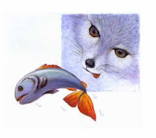
This illustration was done for an SCBWI Westside Illustrator's exercise. All members were given the text to a story about an arctic fox to illustrate. Then we brought them to the meeting to share. It was very interesting to see the many different ways the story was illustrated. No, sorry, the little arctic fox didn't catch the fish.
The original is 10x9 pastel.

2.05.2007