1.28.2011

IF - Surrender

A giraffe in a boat,
and a stubborn little girl with plans...
guess who surrenders?


Tea Party
4x6

This is one entry in my sketchbook for
The Sketchbook Project: 2011

To see my complete sketchbook CLICK HERE.

1.27.2011

The Sketchbook Project: 2011 "Inside/Outside"

This is my contribution to The Sketchbook Project: 2011 with Art House Coop. My chosen theme is "Inside/Outside", which is great since I've been exploring dwellings in my illustrations as well as my fine art paintings. That seems to be my thing lately - tree houses, playhouses, windows, doors, interiors, etc, so it was a fun project for me. Of course, I had a gazillion more ideas that never made it to the sketchbook, but at least some of them are on paper.

The sketchbooks will be on tour around the country throughout 2011, ending as part of the permanent collection at the Brooklyn Art Library.
----


----

To find out if The Sketchbook Project: 2011
is touring in your area CLICK HERE

1.17.2011

Book Cover Illustration and Design

I recently worked on a project for a book cover, so I thought I'd share a little of the process with you.

First I met with the author of the book and discussed the core message which I'll do my best to summarize:

Trumping the Red Queen
by Ralph Frid, Ph.D., is a heavily researched book that takes a serious look at innovation and creativity in today's times. The Red Queen from Alice in Wonderland is used as a metaphor. She represents business structures and systems born in the industrial revolution which no longer work efficiently in our fast paced, changing world. In the book the author explains a unique form of learning called Hyperstruction, increasing innovation and creativity without running everyone into the ground.

The client wanted the character of the queen to be the focal point of the cover.
She is dictatorial, mythological, rigid, feared and living in the past. She is satisfied with her reality as she explained it to Alice, "Now, here, you see, it takes all the running you can do, to keep in the same place. If you want to get somewhere else, you must run at least twice as fast as that!"
It was also important that the cover expressed an element of hope, innovation, and new beginnings.

At first, all I could think about was, "Fifteen years of the author's life has been devoted to the the research and writing of this book and I only have a few weeks illustrate the cover. I'd better make this illustration count!" Then I got to work reading the Trumping the Red Queen, and researching the characters in the original stories of Alice in Wonderland and Through the Looking Glass to refresh my memory.

The next step was brainstorming with lots of rough sketches: Different types of crowns, ways to illustrate the old crumbling system... and how do you illustrate creativity or hope, anyway? Should I use symbols of the red queen or an outright portrait?

Then I pulled together elements from the rough sketches and came up with the portraits above. The last one was just for fun... couldn't resist!

I also explored other approaches using symbols for the queen rather than a character. On the left, gears & smoke stacks to represent the industrial revolution, and figures struggling to stay ahead the old way. On the right I went for a more techie feel to represent our times, the instability of change and movement into the future.

The client loved the center portrait of the Queen of Hearts.
I used angular features and a downcast gaze to project the queen's character. I used gears and smokestacks as symbols of the industrial revolution. I chose Black, white, red, yellow, the traditional colors of playing card, and mimicked the typical Queen of Hearts pose. Factory smokestacks, industrial gears, fast moving freeways represent our fast paced world today and echo the queen's words to Alice.

Below are some different ideas about placement on the cover to dramatize the deterioration of the old way.

The client chose the middle image because it is bold and straight forward. The only element missing in the design was an element of hope which I added later on the computer.

I created the portrait of the Queen of Hearts using soft pastels and pastel pencils on white PastelMat, which was the perfect surface. It's velvety texture took layers of rich color easily and it was easy to get a smooth thin line as well for the details. I used PanPastels to block in color of the main elements and shadows, applying rich solid color quickly. The variety shapes of the small Sofftool Knives, were very easy to use for filling in colors and blocking in square or triangular shapes. I then added details with pastel pencils.

The above left image was scanned on my home computer which just didn't cut it, even with editing. So, I had the illustration scanned professionally, enhanced the color in Photoshop to match the color of the original, cleaned it up a bit and added the pawns, which were drawn and scanned separately (right). At this point it was ready incorporate into the cover design.

I used Adobe Illustrator to add bold red and yellow color creating a glow and a swirl design to give the impression of movement. I put the layout together in InDesign. Here is the final cover design of the book submitted to the publisher.


Read more about
Trumping the Red Queen by Ralph Frid, Ph. D on the. Official Blog

12.14.2010

Book Signing Event at Borders


Children's Gift Book Signing Event

December 19, 1-3 pm

Borders
429 South Associated Road
Brea, CA 92821
714.672.0120

Cathy June | Merrily Kutner | Irina Mirskaya
Angela Waterman


Meet four children's book authors and illustrators
and have books personalized for you and the kids you love.
Lots of free activities and fun giveaways too!


~ Hope to see you there! ~

9.30.2010

Orange County Children's Book Festival

Irina Mirskaya, illustrator of We Love the Company and I will be at the
Orange County
Children's Book Festival

Orange Coast College, Costa Mesa, CA
Sunday, October 3rd, 1:30 - 3:00

CM School Supply booth #19


Come by and say hello!

7.07.2010

Pages: A Bookstore

Bring the little ones and join me for story time.
We'll read We Eat Food That's Fresh!,
sing along with the chef,
and make our own chef hats to take home too!

Monday, July 12th, 10:30AM
at the new independent bookstore

Pages
904 Manhattan Avenue
Manhattan Beach, CA 90266
310-318-0900


See you there!


* * * Do you have children's books that you don't need? * * *

make room on your bookshelf
brighten a child's world
help a young man become an eagle scout

Ben Bravo, of Boy Scout Troop 65 is an Eagle Scout candidate. For a service project he is building a small library for a battered women and children's shelter in East Los Angeles called the House of Ruth. He's asking for new or gently used children's books for the ages of 0-10. Books written in English and Spanish are appreciated.

You can drop off your book donations at

Pages
904 Manhattan Ave Manhattan Bch., CA
until Monday, 7/12/2010, 11:30am

Chemers Gallery

17300 17th Street, Tustin CA
until 7/13/2010

4.02.2010

Benjamin Franklin Award Winner 2010

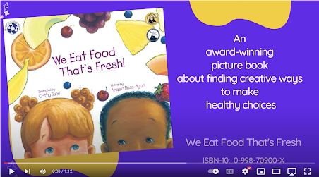
I'm thrilled and announce that We Eat Food That's Fresh! published by Our Rainbow Press, is the 2010 Benjamin Franklin Award winner for the Children's Book & Audiobook Set category. "Named in honor of America's most cherished publisher/printer, the Benjamin Franklin Awards™ recognizes excellence in independent publishing. Publications, grouped by genre are judged on editorial and design merit by top practitioners in each field." Our Rainbow Press is a children's book publisher dedicated to enriching children's lives with quality books that promote self esteem, early reading and literacy, healthy living, and family values.


A simply edible book that is rich in colorful fruits and vegetables. Inspires all ages to have a taste of something new! --Produce For Better Health Foundation